Petro.ai
Role: Art Direction, Branding
Goal: Help an oil drilling company brand their newest product with a “slick” new logo.
Duration: 4 weeks
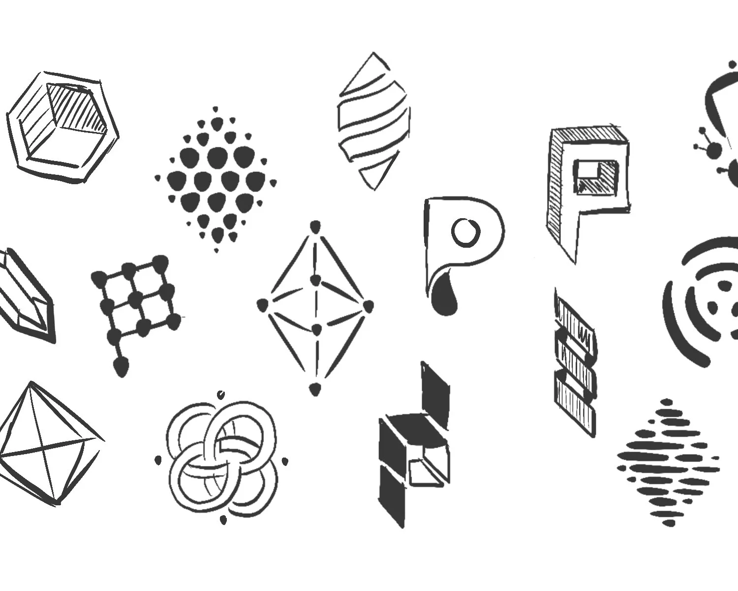
“In my opinion, every good logo starts out with a sketch. With every stroke, there’s the opportunity to find a curve, edge, or shape that will prove invaluable during the artistic process. Even in this first sketch, I can see elements of the final logo.”

“The client’s main offering was an analytics software suite purpose-built for oil and gas drilling. Therefore, as I refined my sketches on the computer, I gravitated towards forms that evoked futuristic concepts, such as AI and machine learning, coupled with shapes that resembled towers, drills, and geologic elements.”

“As the mark evolved, so did the client’s idea of what they wanted to see. They decided to focus on shapes that represented strength, stability, and security. This helped us narrow things down to the final three marks.”

“Once the final mark was chosen I moved it to a simple grid to make sure every part of it was pixel perfect. It also allowed me to see any inconsistencies between ‘positive’ and ‘reversed’ colors, adjust proportions, and in this case, make sure the client received a perfectly square mark. The client also asked that the logo feel ‘dimensional’ hence the addition of 3 values.”

“Now it was time to move onto typography. Keeping in mind their preferences from before, I offered an assortment of bold font choices to match the strength of the mark.”

“The client chose ‘Proxima Nova’ as their preferred font. Once they did it was back to my grid where I adjusted the font’s original kerning, adjusted the weight of ‘petro’ versus ‘AI’, and determined the appropriate positioning of the mark in relation to the type. This is also a good time to set the ‘clear space’ for the logo moving forward.”

“Now that we had a functional logo, it was time to choose a color scheme. It’s a tough thing to romanticize oil drilling, but I decided to focus on colors that evoked the beauty of the desert. The competitive space was full of blues and grays so I did my best to stay away from those. In addition, I made sure all color schemes passed ADA accessibility standards for the web. As a side note, I enjoy naming my color schemes. Its fun for both me and my clients and gives each look a bit of personality.”

“The client chose ‘Royal Desert’ for the color scheme. Personally, purple reminds me of AI, so I thought it was a great choice! Now it was time to deliver the final logo.”

“In addition to the final logo, I provided the client with usage guidelines including suitable background colors and a list of do’s and don’ts.”


“The client was extremely happy with the logo. I later heard the client mention that during trademarking, their lawyer, who had seen thousands of logos in his career, commented that the mark was ‘one of the most distinctive, elegant, and unique’ logos he’d ever come across.”